The Portfolio App
The Portfolio surface gives you a rolled-up view of your programs and initiatives — their health, what's at risk, and how work aggregates from individual items up to the program level.
Because InaiBridge maps every source into one canonical record, the Portfolio spans all your connected tools at once: programs from Jira, Asana, and Azure DevOps appear together, each carrying its own honest confidence label.
What you see
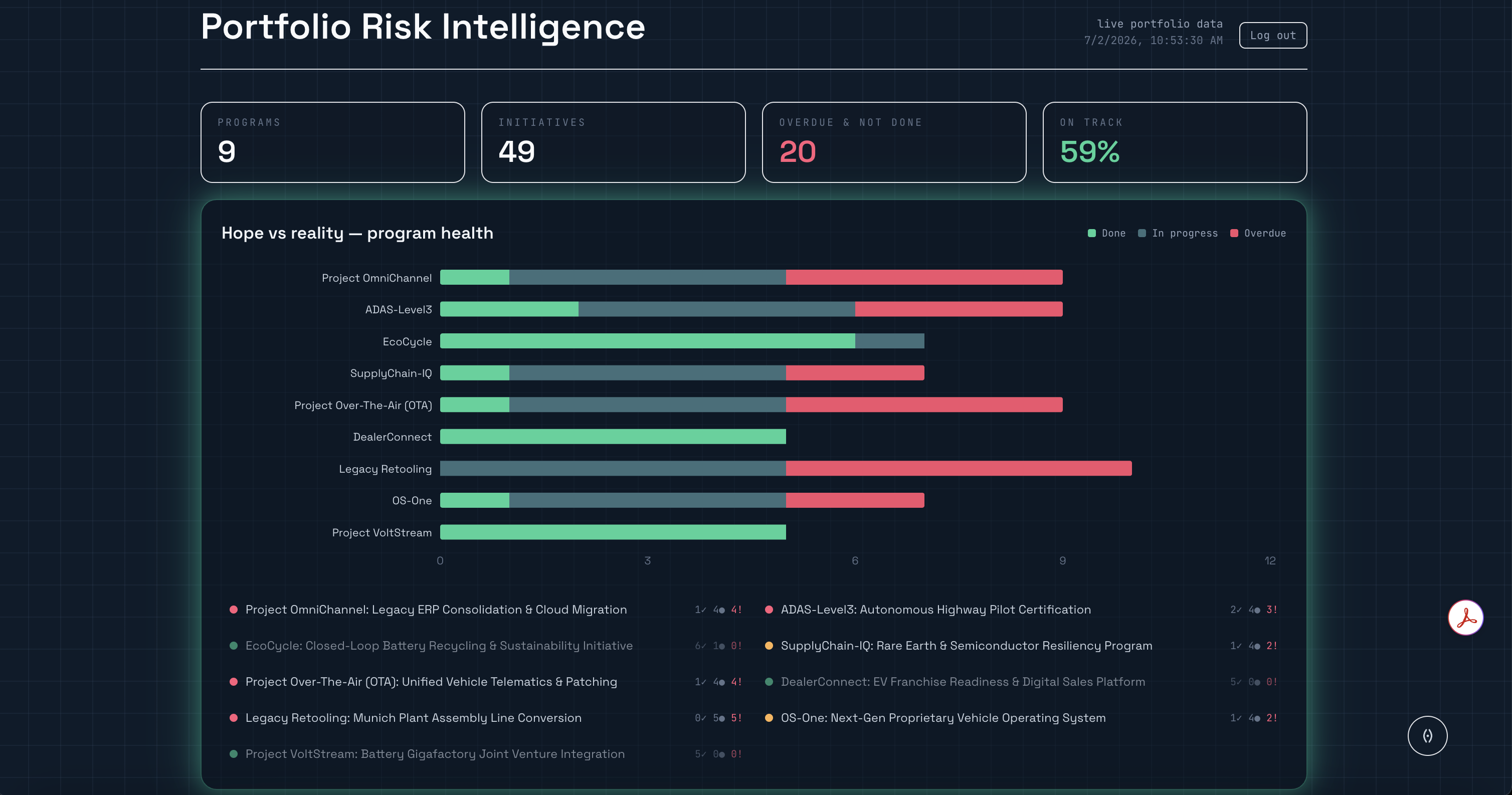
- A program-health graph. Each program is a bar broken down by state — done, in progress, and overdue — so you can see at a glance how much of it is at risk.
- Portfolio totals. Across everything connected: how many programs and initiatives you have, how many are at risk, and the percentage on track.
- An AI risk briefing. A grounded briefing over the portfolio — where things stand now, what the current situation resembles from the past, and the takeaway. See Project Intelligence.
- Root-cause synthesis. The most common themes behind the risk, and the programs most threatened.
Drilling in
Select a program to focus on it: the view narrows to that program's at-risk initiatives. Select it again (or choose "show all") to return to the whole portfolio.
Ask about what you're looking at
The Portfolio includes Jiggle, a grounded companion. When you've selected a program, Jiggle scopes its answers to that program; with nothing selected, it answers across the whole portfolio. The panel always states what it's grounded in, so the scope of an answer is never ambiguous. Jiggle answers only from your real portfolio data.
Honest confidence
Health and at-risk status come from your actual work items, mapped into one canonical record. A program is not shown as on track just because a source couldn't prove otherwise — each figure carries the confidence its source supports.
:::note Roadmap The dashboard graph is labeled "Hope vs reality." Today it shows current program health by state (done, in progress, overdue) and at-risk counts — not a planned-vs-actual comparison. A true baseline comparison (variance against a plan) is designed but not yet available; it depends on baseline/plan data the connectors don't yet capture. :::